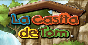
The comparisons between three websites base on colors, background, images, navigation and fonts. The websites are named “The Bakery”, “Baguette & Butter” and “La Casita de Tom”. The fonts of three websites are in a middle size and are very easy to read. The Bakery website uses four color schemes, like black, white, dark orange and light orange. The Baguette & Butter website uses five color schemes, like grey, blue, light pink red, black and white. Besides, the color schemes of “La Casita de Tom” website are totally different than these two website. The website it’s designed based on the carton forest feeling, which is more colorful and is very catchy. The style of “The Bakery” website is very simple because the background of the website is only white. But the “Baguette & Butter” website uses a wooden picture as the website background. The “La Casita de Tom” uses a combination of animation and a real life person picture as the website background.The similarities of the three websites are the blog name is on the middle of the website. There are three same media links on the “The Bakery” and “Baguette & Butter”, like Facebook, Twitter and YouTube. The images are shown on the middle of the website; it has narrows at both sides and it’s automatically rotate by itself. “The Bakery” and “La Casita de Tom” website has they own gallery but the “Baguette & Butter” website does not have a gallery. The navigators of “The Bakery” and “Baguette & Butter” are changes color when the mouse is moving. But the navigator of “La Casita de Tom” website is colored with green and white and is stilled. The “Baguette & Butter” and “La Casita de Tom” websites use the simple drawing graphics with words to represent their website. But “The Bakery” website only uses a font as the name of the website, no other effects.


